Quiet Luxury: Muted Palettes and Tactile Layers for Refined Minimal Interiors

Today we explore muted color palettes and texture pairings for elevated minimal interiors, celebrating calm hues, nuanced undertones, and tactile materials that invite touch and slow, restorative living. Expect practical guidance, honest stories from real spaces, and actionable ideas for building rooms that look effortless, feel grounded, and age gracefully. Share your questions, subscribe for monthly palettes, and tell us what textures you’re pairing at home.

Color Foundations: The Power of Restraint

Muted colors succeed when they whisper rather than shout, allowing architecture, light, and texture to lead the conversation. Build a base from bone, stone, and soft greige, then introduce quiet shifts in value and undertone to create depth that remains restful and consistent in changing daylight.

Texture Pairings That Breathe

Texture gives muted palettes a pulse. Blend airy linens, brushed wool, limewash plaster, raked timber, honed stone, and softly gleaming metals to create contrast without clutter. The goal is tactile calm: generous negative space, human-scaled materials, and honest finishes that invite touch, soften acoustics, and reward quiet attention.

Soft Meets Structured

Pair a slouchy linen slipcover with a crisp oak frame, or a cloudlike wool rug beneath a rectilinear steel coffee table. The interplay reads balanced rather than busy, letting softness temper geometry while structure grounds comfort. This push and pull builds poise, not drama, in serene rooms.

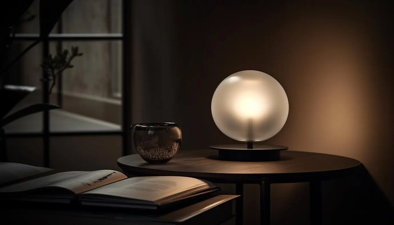
Matte with Subtle Sheen

Combine chalky limewash walls with satin-bronze hardware, or honed limestone backsplashes with lightly waxed oak. Micro-shifts in reflectivity produce depth without sparkle, catching light softly and guiding the eye along planes. The result feels luminous yet composed, like candlelight gently revealing crafted surfaces and thoughtful joinery.

Organic Joined with Engineered

Contrast raw travertine or tumbled terrazzo with impeccably poured microcement, or wool bouclé with precision-milled aluminum. The conversation between nature’s irregularity and human engineering creates relatable tension, reminding us that refinement thrives when wildness is welcomed, measured, and thoughtfully framed rather than polished away into sterility.

Room-by-Room Quiet Confidence

Apply principles with sensitivity to context. In shared spaces, prioritize durable textures that welcome wear; in private rooms, lean into cocooning fabrics and softened edges. Keep muted palettes continuous across thresholds, but allow subtle shifts in value and tactile density to signal purpose, rhythm, and changing daily rituals.

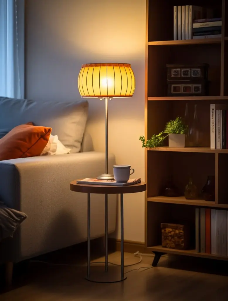
Living Areas That Invite Conversation

Anchor seating with a dense, low-pile wool rug that quiets sound, then layer a bouclé sofa, linen cushions, and a honed travertine table. Choose a calm paint like soft oatmeal. Let one sculptural timber piece add character while cords, clutter, and visual noise stay gracefully hidden.

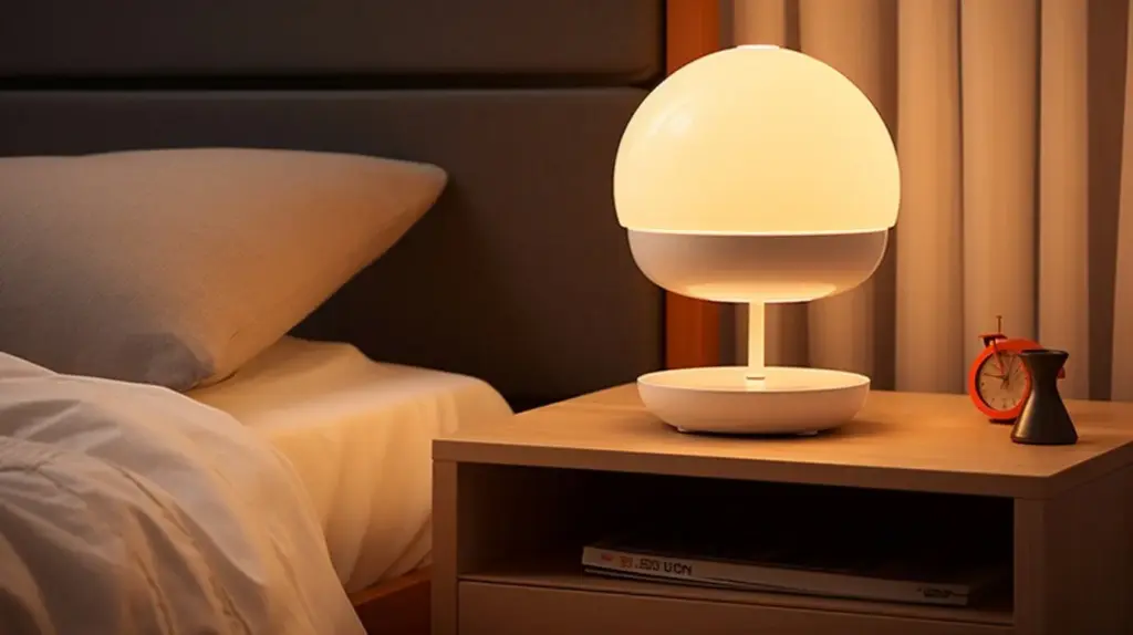
Bedrooms for Restorative Sleep

Favor breathable percale, relaxed linen, and a whisper-soft wool throw. Paint walls in pale mushroom or stone, avoiding optical brightness. Blackout drape linings protect circadian rhythms, while textured plaster behind the headboard eliminates the need for heavy decoration, creating depth, shadow play, and a quietly enveloping sense of safety.

Kitchens and Baths with Poise

Choose matte cabinetry, softly veined quartzite, and finger-pull profiles to reduce visual clutter. In showers, pair microcement walls with tumbled stone floors for grip and movement. Patinating unlacquered brass introduces gentle, living warmth that echoes linen towels, pale grout, and morning light filtered through frosted glass.

Color Stories from Real Spaces

Ground ideas in lived experience. Designers often discover that the most memorable rooms rely on just two or three desaturated hues animated by texture. These snapshots reveal how carefully tuned undertones, natural light, and a few tactile gestures can transform ordinary plans into restorative sanctuaries.

Seaside Calm in Forty Square Meters

A south-facing micro-apartment used sea-mist paint, limewashed plaster, and driftwood oak to echo the coastline without souvenirs. A flat-weave jute rug tamed echo, while translucent linen softened glare. The owner says visitors lower their voices immediately, sensing quiet hospitality that never feels staged or precious.

Loft Serenity Above Industrial Streets

In a converted warehouse, smoke-gray microcement wrapped walls and floors, interrupted only by pale ash shelving and a single travertine plinth. Acoustic felt panels vanished behind stretched linen. Despite traffic below, conversations unfolded gently, as if the surfaces themselves requested patience, listening, and deliberately unhurried gestures.

Testing at Scale, Not Postage Stamps

Paint at least A2 sheets or entire drywall patches, then move them around. Drape fabric over furniture, not flat on tables. View with curtains closed and open. Collect feedback from anyone living there, and prioritize sensations—calm, clarity, softness—over brand names or fleeting social validation.

Building a Tactile Library

Create boxes of labeled offcuts: oak, ash, walnut; limestone, terrazzo, quartzite; cotton, linen, wool. Touch combinations blindfolded and note feelings. This playful exercise reveals surprising affinities and helps you design for the hand as much as the eye, boosting confidence in quiet, nuanced decisions.

Sustainability and Longevity with Grace

Quiet design respects health and resources. Favor low-VOC paints, natural oils, solid wood from certified forests, and durable textiles that can be repaired. Choose fewer, better pieces that patinate beautifully, so rooms evolve with you, gaining richness through years of use rather than disposable novelty.
Lilotevumopevinekixaxe
Privacy Overview

This website uses cookies so that we can provide you with the best user experience possible. Cookie information is stored in your browser and performs functions such as recognising you when you return to our website and helping our team to understand which sections of the website you find most interesting and useful.